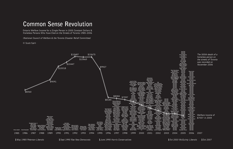
This graph is related to a blog post on how many people each year die from living on the streets. It shows the contrast between social service cuts during Mike Harris’ Common Sense Revolution and an increase in homeless deaths in Toronto.
Infographics
This graph is related to a blog post on how many people each year die from living on the streets. It shows the contrast between social service cuts during Mike Harris’ Common Sense Revolution and an increase in homeless deaths in Toronto.
